Maxfield Parrish
What is Parrish blue? How Maxfield Parrish painted his skies
The deep, luminous blue of Parrish's skies came from a method, not a tube of paint. Here is how he did it.
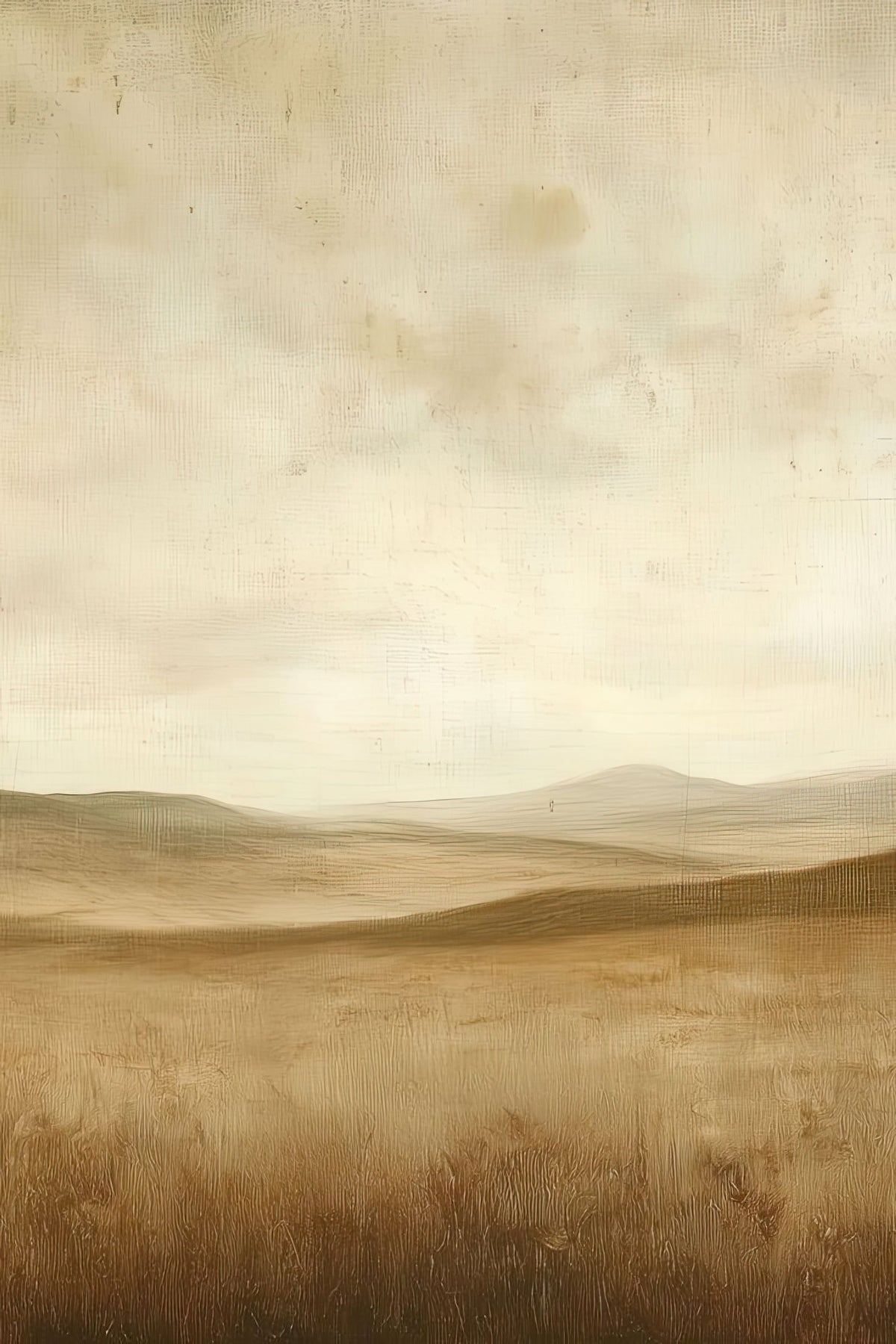
Parrish blue is the deep, glowing blue of Maxfield Parrish's skies: the colour of a clear evening in the minutes after sunset, so intense it seems to give off light. It is named after him because no one else's blues looked quite like it. The secret was not a single tube of paint but a method: Parrish built his colour in many thin, transparent layers over a white ground, sealing each with varnish. Here is how he did it, what the pigment was, why some of his paintings now look golden, and how to show the blue at its best at home.
Where the name comes from
Parrish (1870–1966) was one of the best-known American illustrators of his day. His magazine covers, book plates, calendars and prints reached millions of homes, and the same blue ran through almost all of them: in the sky of Daybreak (1922), behind the figure on the rock in Ecstasy (1929), over the snowy hills of his later landscapes. People began to call that colour after him, and the name stuck. Paint makers still sell blues named after him today.
How Parrish painted his blue, step by step
Most painters mix colours on the palette and lay them down opaque. Parrish worked the other way round, closer to the old masters than to his contemporaries.
- A white ground. He painted on smooth panels, often Masonite, which was new at the time, coated with a pure white ground. The white is the source of the glow: everything above it is transparent enough to let it shine through.
- A blue underpainting. He painted the whole picture first in blue and white, a monochrome version that set the light and shade. Accounts say he used the blue straight from the tube for this stage.
- Glazes of pure colour. Over the underpainting he laid thin, transparent glazes, often of a single colour each, rather than mixing them on the palette. The eye mixes the layers on the panel.
- Varnish between every layer. Each glaze was sealed with varnish and left to dry before the next. Writing in 1950, Parrish named the copal picture varnish he used.
- Repeat. A single painting could carry many such layers, which is why his pictures took so long and why they have a depth that flat reproductions struggle to match.
Why the blue seems to glow
The effect is optical, not chemical. When paint is opaque, light bounces off its surface and you see the colour of that surface. When paint is transparent, light travels down through the layers, reflects off the white ground and comes back up through them again. Each pass through a glaze filters the light a little more, so the colour you see is richer and deeper than any single layer, and it carries the brightness of the white underneath. That is why a Parrish sky looks lit from behind, like stained glass, rather than painted on.
Varnish between the layers adds to it. Each coat is a clear film that separates the glazes, so light scatters slightly as it passes, giving the colour its soft, luminous depth.
Cobalt or lapis lazuli?
Ask which pigment made Parrish blue and you will get two answers. Most writers tie it to cobalt blue, a stable, clean blue widely used by painters of his time. The National Academy of Design's record describes it instead as derived from a lapis lazuli–based pigment, the mineral behind natural ultramarine. The sources do not settle the question, and Parrish's palette changed over a long career.
What matters more than the pigment is the method. A cobalt or an ultramarine laid on opaque looks like any other blue. Laid in transparent glazes over white, with varnish between, it becomes Parrish blue.
Why some Parrish paintings now look golden
If you have seen a Parrish original and found it warmer than you expected, the varnish is the reason. Natural resin varnishes yellow with age, and Parrish's paintings carry many layers of it, between the glazes as well as on top. Over decades the whole picture shifts towards gold.
It also makes the paintings hard to restore. On most old paintings a conservator can remove yellowed varnish from the surface. On a Parrish, the varnish is sandwiched between the layers of colour, so taking it off would take the painting with it.
Where to see Parrish blue
- Daybreak (1922): the full range, from pale gold at the horizon to deep blue overhead. The story of Daybreak.
- Ecstasy (1929): painted for the 1930 Edison Mazda calendar, a figure against a towering blue sky and white clouds.
- The night scenes: his moonlit and winter evening pictures push the blue almost to violet.
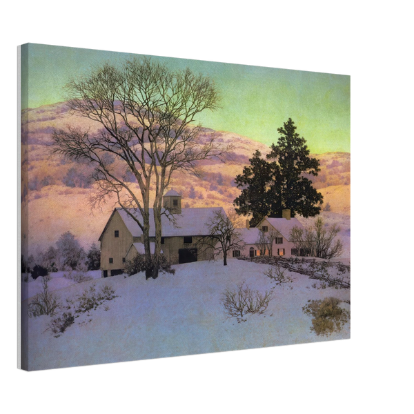
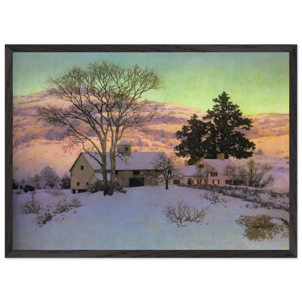
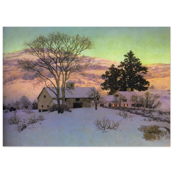
- The landscapes: from the 1930s he painted mostly landscapes of the hills around his home, many for Brown & Bigelow calendars, with the blue in the sky and the shadows of the snow.
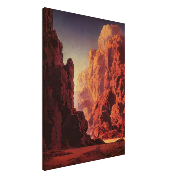
Our collection gathers his landscapes, winter evenings and night skies, where the blue is at its deepest, as posters, canvas prints and framed posters: night skies and twilight, landscapes, or the whole collection.
How to show Parrish blue at home
A print cannot reproduce the layers of glaze, but it can carry the colour, and how you hang it changes how the blue reads.
Light
- Avoid direct sun. Strong sunlight fades any print over time and washes out a deep blue. Choose a wall that gets daylight indirectly.
- Warm, not yellow, at night. Bulbs of about 2700 to 3000 K keep the gold of a Parrish sky warm without turning the blue green.
Wall colour
- Warm whites, sand and stone make the blue look deeper by contrast.
- Deep rust or terracotta echoes the gold in his skies and makes the blue the brightest thing in the room.
- Avoid a blue wall close to the tone of the sky: the picture loses its edge.
Format
- Framed poster: behind UV-protective acrylic, the safest choice for a bright room.
- Canvas: the weave softens the subtlest gradients and gives the sky a painterly surface.
- Poster: printed on 250 gsm fine art paper, unframed, so you can choose a frame that suits the room. A black or natural wood frame keeps attention on the colour.
Every format and size is compared on The prints. Screens show colour differently, so the blue of a print in daylight will never be exactly the blue on your phone; that is true of every reproduction.
Questions about Parrish blue
What is Parrish blue?
The deep, luminous blue of Maxfield Parrish's skies, named after him. It comes from his method of painting transparent glazes over a white ground, each sealed with varnish.
Did Maxfield Parrish invent a colour?
Not a new pigment. He used blues that other painters had, but his way of layering them produced a colour so distinctive that it took his name.
Is Parrish blue cobalt blue?
Most accounts say it was based on cobalt blue; the National Academy of Design's record says a lapis lazuli–based pigment. The effect depends more on his glazing than on the pigment.
Why do some Parrish paintings look yellow?
The many layers of natural varnish in his paintings have yellowed with age. Because the varnish sits between the layers of colour, it cannot be removed without damaging the painting.
Which Parrish painting shows the blue best?
Daybreak (1922) and Ecstasy (1929) are the best-known examples; his night and winter landscapes show the deepest blues.
Bring the blue home. Every Parrish work in our shop comes as a poster, a canvas or a framed poster, in 50 × 70, 60 × 90 or 70 × 100 cm, made for your order and delivered free to 37 countries. Browse the collection.